
1. Leo Chan
http://leoriginalchan.blogspot.com/
2. Ben Chan
http://bjcyc.blogspot.com/
3. Liz Grayburn
http://lizgrayburnsblog.blogspot.com/
4. Stella Ho
http://stellaanddesign.blogspot.com/
5. Hae Lin Kang
http://liah90.blogspot.com/
Thursday, November 4, 2010
Sunday, October 24, 2010
Assignment 2- UPCYCLING: Rationale
Crude latex rubber has very few uses but for those which it is suitable, it often boasts many qualities which allow. Primarily you will find it used as car tyres, conveyer belts, shock absorbers and anti-vibration mountings in pipes and hoses. However rubber is not recyclable, has infinite uses and is very resilient. The material is a major source of waste in developing countries that could be put to better use. This is why for my “Upcycling” project I chose to look into the reusing of scrap tyres and their inner tubing material.
Recovering rubber is quite a process but is worth the effort. Recovering rubber is half the cost of having to use the virgin material, and most thrown away tires only have a few faults which render them unusable for vehicles, such as punctures of any size or loss of grip from years of use. Also, promoting recycling activities in exchange for basic needs such as food and clothing are effective for minimising needless waste and environmental degradation in developing countries.
95% of disposed jeans and other basic textiles are reusable, but also end their life cycle in landfill.
“If each person bought one recycled garment each year, it would save an average of 371 million gallons of water and 480 tons of chemical dyestuffs.” This is a quote from Antur Waunfawr, who founded a recycling service and recognises the amount of perfectly usable material that we are wasting. In recycling we reduce the need for sheer landfill space, reduces pressure on virgin resources as well as reducing the amount of pollution and waste of energy (estimated 50%) and resources in manufacturing a material from scratch. I also chose to make use of discarded fabrics, as its infinite variety contrasted the jet black look of the rubber mat.
Out of all the wallets I’ve ever owned only a few include a coin purse, which I feel is essential for purchasing train tickets etc. Almost none of these wallets were even vaguely appealing to me in aesthetics, being solid jet black leather or a single colour with little variation. As I have adopted an appreciation of the grungy punk culture look the mix of textiles and fabrics (tartan, checkers and ripped denim) I gathered seemed mostly appropriate to uphold this. My redesign of the wallet upcycles some rubber matting and includes a Velcro sealed coin purse made from the inner pocket of a pair of jeans, and two card pockets from various materials.
Monday, October 11, 2010
Sunday, September 26, 2010
Peers Blog Comments
Jason
http://z3333692.blogspot.com/
Krista
http://kristamav.blogspot.com/
Jimmy
http://www.z3332715.blogspot.com/
Santi
http://z3330189.blogspot.com/
Ben
http://bjcyc.blogspot.com/
Great work guys (and Krista), looks great!
http://z3333692.blogspot.com/
Krista
http://kristamav.blogspot.com/
Jimmy
http://www.z3332715.blogspot.com/
Santi
http://z3330189.blogspot.com/
Ben
http://bjcyc.blogspot.com/
Great work guys (and Krista), looks great!
Tuesday, September 21, 2010


Experience Enrichment- Rationale
Not unlike standard gym fitness and cardiovascular equipment, dumbbells (handheld weights, often varying in weight) I find have an overly simple, outdate, industrial and purely functional look. As it is often built straight out of solid metals such as steel, the unforgiving surface often provokes calluses and other kinds of skin damage to the hand. In addition to this dumbbells are an eyesore even when they are not in use, often being kicked beneath a bed as people visit.
I felt an alternate design was required, and I looked to a sculptural design style. It would be beneficial to the market gym products in putting an end to the dumbbells incredibly unattractive aesthetic, as well as opening up opportunities to better the ergonomics as well.
The redesign of the dumbbell is improvement in many ways. In accordance to the primary goal of the redesign, the sleek silver modern finish on the metal enhances the natural beauty of the dumbbells organic shape as well as giving it a contemporary feel, allowing it to blend into the atmosphere of the modern household and/or gym. The interesting choice of shape in the dumbbell creates a talking point amongst friends and guests who encounter it; its presence is compatible with a kitchen, lobby, bedroom, bathroom or living room setting as while it is non-functional it acts as an artistic centrepiece.
The deceptively heavy weight encourages a more casual approach to weight training by using its small stature and size to subconsciously convince the user into a positive frame of mind, of being able to use the weight with ease and thus benefit. The standard dumbbell is designed and constructed perfectly symmetrically (prior to optional tampering when adjusting for a heavy or lighter weight in customizable weights) and therefore balance was no issue in need of a solution.
From the moment I first set my eyes on gym weights as a designer, I knew the age of heavy industrial weights were over. The trend of redesigning fitness equipment paves the way for the future of a public gym’s aesthetics, a more attractive exercise space, and thus potentially a more health conscious population.

The setting of the modern gym boasts to advances of design such as organically shaped treadmills. The days of heavy industrial weights are over.
I felt an alternate design was required, and I looked to a sculptural design style. It would be beneficial to the market gym products in putting an end to the dumbbells incredibly unattractive aesthetic, as well as opening up opportunities to better the ergonomics as well.
The redesign of the dumbbell is improvement in many ways. In accordance to the primary goal of the redesign, the sleek silver modern finish on the metal enhances the natural beauty of the dumbbells organic shape as well as giving it a contemporary feel, allowing it to blend into the atmosphere of the modern household and/or gym. The interesting choice of shape in the dumbbell creates a talking point amongst friends and guests who encounter it; its presence is compatible with a kitchen, lobby, bedroom, bathroom or living room setting as while it is non-functional it acts as an artistic centrepiece.
The deceptively heavy weight encourages a more casual approach to weight training by using its small stature and size to subconsciously convince the user into a positive frame of mind, of being able to use the weight with ease and thus benefit. The standard dumbbell is designed and constructed perfectly symmetrically (prior to optional tampering when adjusting for a heavy or lighter weight in customizable weights) and therefore balance was no issue in need of a solution.
From the moment I first set my eyes on gym weights as a designer, I knew the age of heavy industrial weights were over. The trend of redesigning fitness equipment paves the way for the future of a public gym’s aesthetics, a more attractive exercise space, and thus potentially a more health conscious population.
The setting of the modern gym boasts to advances of design such as organically shaped treadmills. The days of heavy industrial weights are over.


Sunday, September 19, 2010
Wednesday, September 15, 2010
Wednesday, August 25, 2010
Wednesday, August 11, 2010

Video Reflections
David Kelley: Human Centred Design
David Kelley’s video enlightened me as to new perspectives in involving humans in the process and interaction with marketed designer products. The recent additions to the design process of integrating behavioural aspects and personalities into modern products introduces what Kelley refers to as the “man-machine relationship”. There is more potential to a product than simply creating it and putting it to use, by use of human centred design designers are now able to stimulate affection from the user to the product, create an interest and basically customize a product to a target market. The fresh versatility in the designer’s job also involves them more into the business and marketing aspect rather than just basic decision making directly relating to the product and its functions.
The video struck me as being important as the various examples Kelley demonstrates to us explore the true nature of human centred design, and have allowed me to develop a more profound understanding on this concept. For example the famous Italian fashion label Prada, New York, a retail store wanted to explore technological advancements and integrate it more into the consumers involvement when choosing, trying on and learning about the products. A team of designers reworked the store into a high tech modern facility in which the dressing rooms boasted liquid crystal glass which could transform from opaque to translucent at the flick of a switch. This allowed the user to try on clothes and immediately receive comments and criticisms on them. Multiple screens in place of mirrors allowed the placement of a delayed screen, which allows a proper view of the back of the clothing. The addition of a scanner and screen allows the user to electronically track the products and interact with them for information. These creative revolutions to clothing stores demonstrate the implementation of human centred design in the sense that the ergonomics of a traditional clothing store have been changed in order better meet the needs of the consumers and in a way heighten the experience of shopping and knowing what you want. In this way, efficiency and celebrating technology everyday made shopping for clothes more enjoyable and interactive for the user.
A fun addition to a designers take on reworking an office working cubicle was a flower in a case that wilted in disappointment as the user leaves the room, and perks up in happiness as the user returns. This enlightened me as I had often assumed the use of novelty style products and humour being detrimental to a products success. The humour makes the user feel as though the user is wanted in the cubicle and brings life and potential to the room.
Kelley’s TED video explored new ways to make products more interactive for the user which I feel all designers should understand in order to bring personality to future products. I learnt that humour, when used well can be in fact a bonus to a mood lightening design, and that making the users experience in interacting with the product more intimate allows for a more satisfied and informed consumer.
http://www.ted.com/talks/lang/eng/david_kelley_on_human_centered_design.html
Saturday, August 7, 2010
Powerhouse Museum Product Sketches
At the Powerhouse Museum and UNSW Red Centre Design Exhibition I discovered a multitude of incredible designs and concepts. Those which had the most significant impact and inspired me the most I sketched with a brief note.


My Design Career
As I progressed from elementary to secondary school I discovered I enjoyed working with design and arts as woodworking, computer design and other interactive media as it let me translate thought to paper, and paper to reality. By high school I had decided to pursue the career of a product designer, as the process would allow me to demonstrate my way of understanding a concept while slowly honing my ability. The Industrial Design course appeared to offer a promising journey with irreplaceable knowledge and technical ability to be acquired.
I have been told by friends, peers and adults alike that my clarity in understanding the requirements of a task often take the form of graphical and visual projects, as they are a vehicle for my expression to be translated from thought to reality. In this way I have always seen myself as an art-oriented individual, years of art tutoring with a close family friend seemingly preparing for such a career. Towards the end of my schooling career I was faced with the choice between Industrial and Graphic design, similar courses from many perspectives, but fundamentally different in purpose. From carefully considering my potential futures from these two subjects, I came to understand that industrial design offered far more potential to create working ideas into working models, prototypes and products in a 3-dimensional space, rather than depicting the concepts.
I often find frustration in the poor and deeply flawed designs of the world in which we live in and which we are forced to interact with in our day-to-day lives. Ironically many of these frustrating designs are within the design workshop with inconvenient and hazardous machinery. However the majority of these products which could potentially be so much easier to use, safer to use, less damaging to our ecosystems and so forth, mostly appear within society and its households. Taking the steps necessary to pursue a design based career is taking steps to help shape the future of design by reshaping faulty concepts into more practical user friendly designs.
I believe almost every problem in the world, both major and miniscule problem, can be solved in a functional, creative, revolutionary design. As a human in this wide world, I look to better the lives of those around us and those yet to be born by attempting to discover solutions to problems through the world of design. Towards the end of my time in UNSW, I intend to offer my ability and thinking to open minded design companies in order to steer the path for the products and designs of the future.
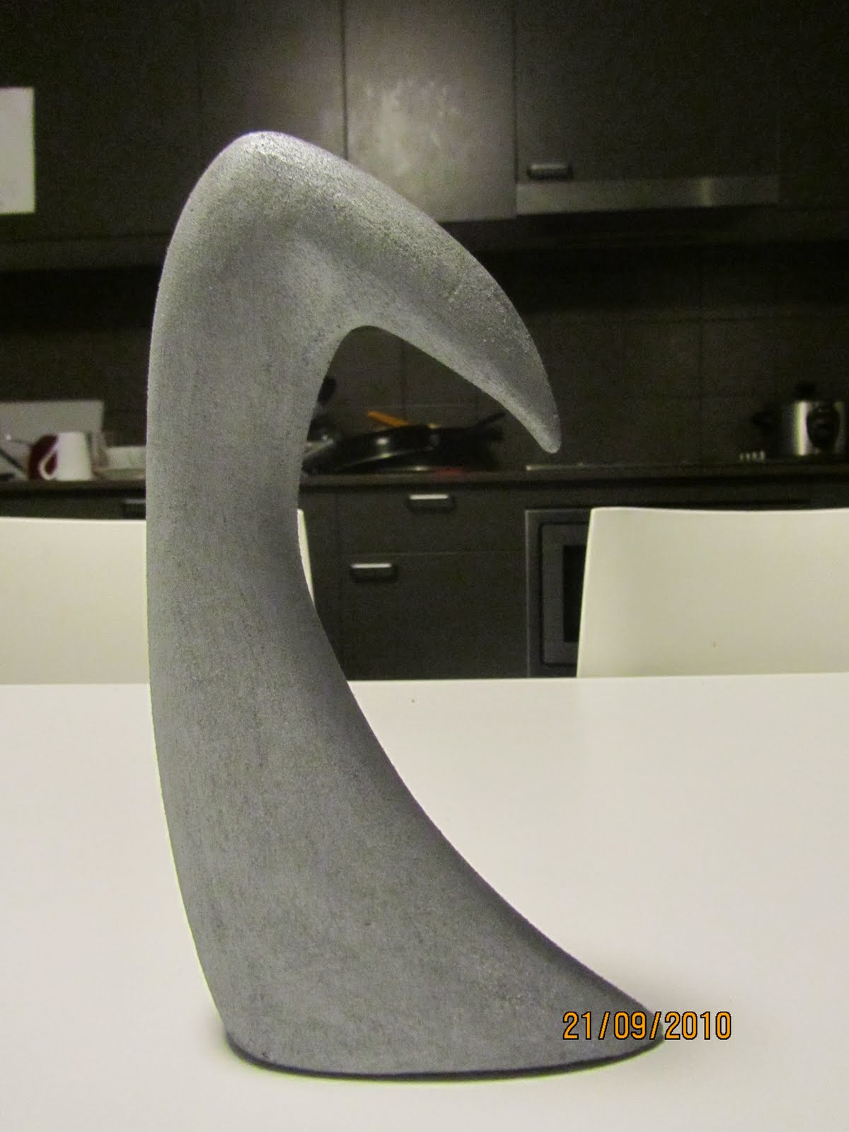
Shape of a Scent
The scent that my group experienced was sharp but pleasant, appearing to linger softly before reaching its strongest scent. We believed this to contain pine and citrus-like ingredients with the target market of older women; however it was revealed to have been intended to be a "father and son" colgone.
Below are photographs of my take on the implications of the scent's shape and texture in the form of a bottle like sculpture constructed with plastacine.


I created a very bulbous base, round and wide to represent the initial bluntness of the smell. As it progressed upwards it trails away to a point, reflecting the sharp finale of the cologne. The texture was kept as smooth as I could muster because the scent itself, while powerful and "loudly-spoken", remained similarly smooth and pleasant. The overall organic shape and leaf like shadows along the sculpture were utilised in an attempt to portray the organic freshness of the scent.
Tuesday, July 27, 2010
Wooo Test Post
This is blog for my Industrial Design course at UNSW. I'll be posting up photos, class work, scans of sketches, internet finds and reflections of my trains of thought before they crash and burn. Every thought has potential so this blog will be my black box for past ideas and thought trains. Toot toot.